Collages and What I Think of Them
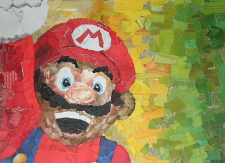
This is one of many Nintendo collages made by Chris Lange, a Washington-based artist. I like how it is made of so many small individual pieces of paper and put together to make one of the most recognisable figures in modern times, Mario.
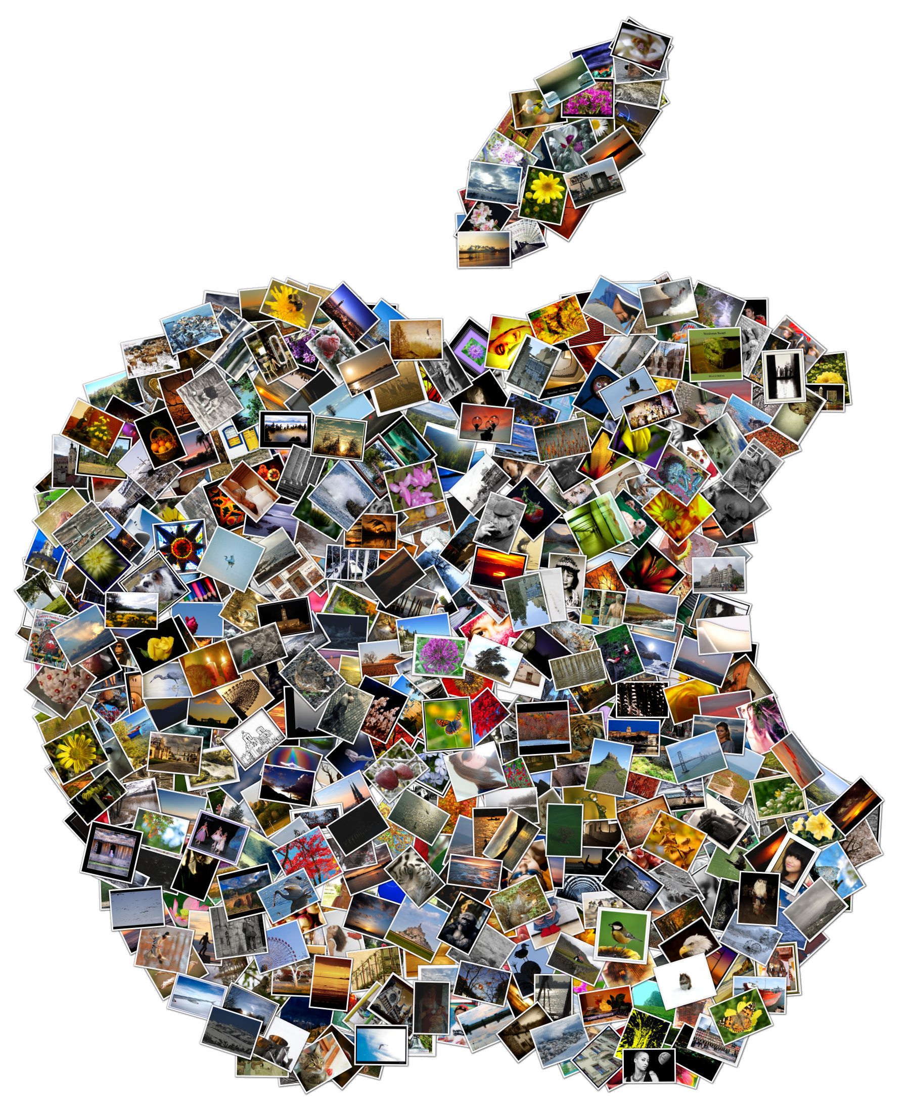
This collage, made by a simple collage-making application (which takes your photographs that you have in a certain folder and creates a shape), is simple yet effective. It is simply an Apple symbol, but the good thing is that it is an apple made of smaller images, the apple being the big picture. Where in a standard collage the small samples being used are usually not standalone images. In this collage, those samples are indeed valid and legitimate images in their own right.
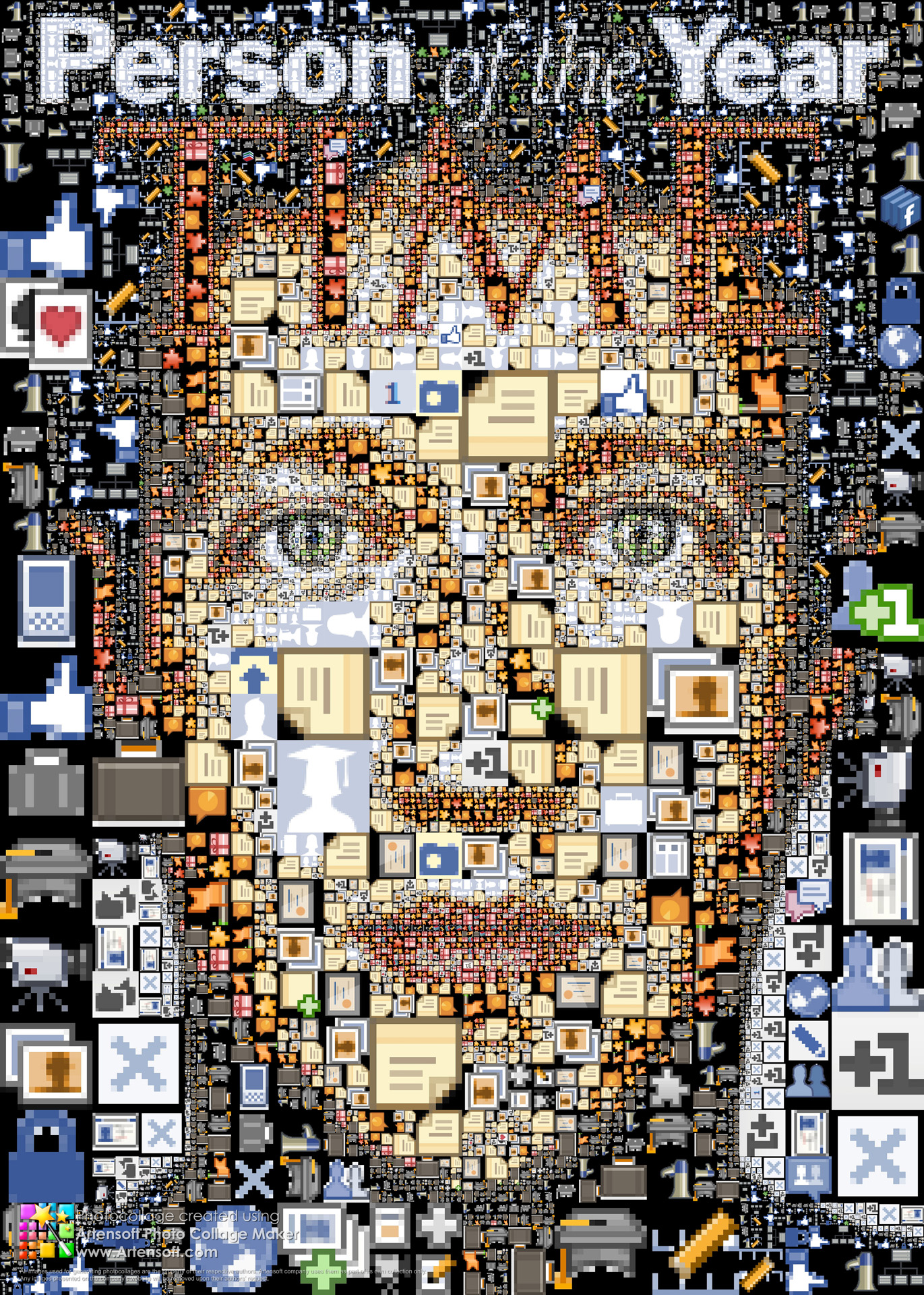
In this collage, made for Time Magazine's Person of the Year, we see many Facebook screen shots and icons that are used to make up the face of Facebook's creator, Mark Zuckerberg. Again, like the above collage, the small pictures used are pictures of their own.
I like the detail of the bigger picture.
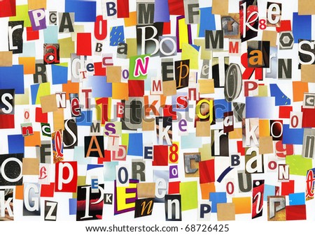
Unlike the other collages I have put on this page up until now, this one does not make a bigger picture. It is simply a collection of images laid out artistically and I think it works great as it is. The images are all coloured shapes, or coloured shapes with white letters inside them.
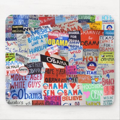
This collage is actually printed on a mouse mat. I believe it was made during Barack Obama's campaign to become the President of America. I like the layout of the various posters(?) as they are all readable, yet there is a sense of them being messily laid out. They were clearly not randomly placed, as I believe planning and thinking went into this collage.
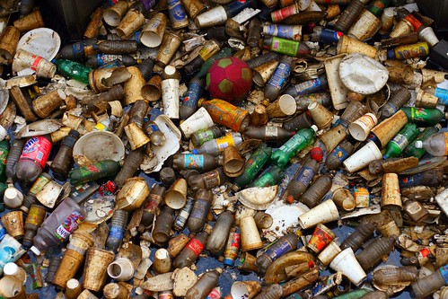
This collage was, I believe, done purely in person and with no help of technology (except, of course, for taking the picture). It seems like someone has taken various objects found in a bin and has placed them inside something then taken the picture, but I think they placed them as they did to give it a messy, randomly-placed feel as like I said it is objects found in a bin, it is likely messy is one of the things the artist was going for.
No comments:
Post a Comment